Jenny Forrest

double pagE SPREAD analysis
MOJO
The drop caps at the beginning of the article is with the letter "W" and is written in a large, bold font. This is the boldest text on the page, so draws the eye towards the article. The article also invites the reader in as its first line is all in capitals, again making it stand out compared to the rest of the text.
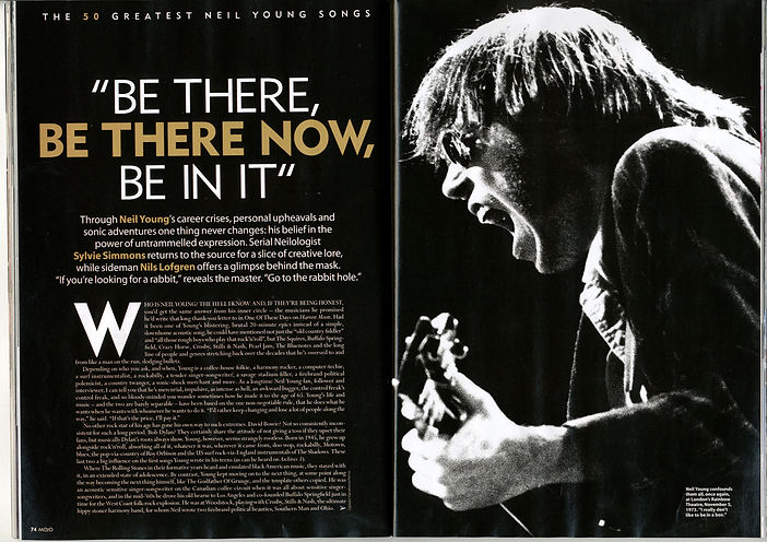
The main image is of Neil Young, as the main article is about this artist. The photograph is in black and white to fit the colour scheme of the double page spread and takes up half of the spread, leaving the beginning of the article and title to fill the other. It is believed that the article does, however, fill onto another page of the magazine, as the arrow to turn the page at the end of the article suggests there is more over-leaf. The main image is of the artist in concert, rather than a posed photograph.
The colour scheme of brown and white corresponds with the front page of the magazine, to which Neil Young appears. Most of the text is written in white, whereas key words and lines, especially in the pull out quote, introduction, and header are written in the brown. Both of these colours stand out upon the black background, making them clear and easy to read. It is essential that the text is easy to read as the article is very detailed, attarcting an audience who want to know more about Neil Young. This double page spread suggests that the reader of Mojo magazine would be more sophisticated than the reader of a magazine such as Kerrang!.
The header advertises "the 50 greatest Neil Young songs", making the article seem as if it is a chart of his greatest songs. To make this stand out on the top of the page, it is written in capitals, all in white except for the figures, which make the "50" seperate, attracting the eye.
A pull out quote above the article gives the reader a greater idea as to what they are about to read and how much detail the article goes into. This attracts the reader as it is the largest text on the page, and there is a repitition of "be", seperated on to three lines, adding to the rule of three.
Below the pull out quote is the introduction, giving the reader a brief history into Neil Young's career history and personal life. It also introduces the writers, to show what they found out, which will be detailed in the article.
q magazine
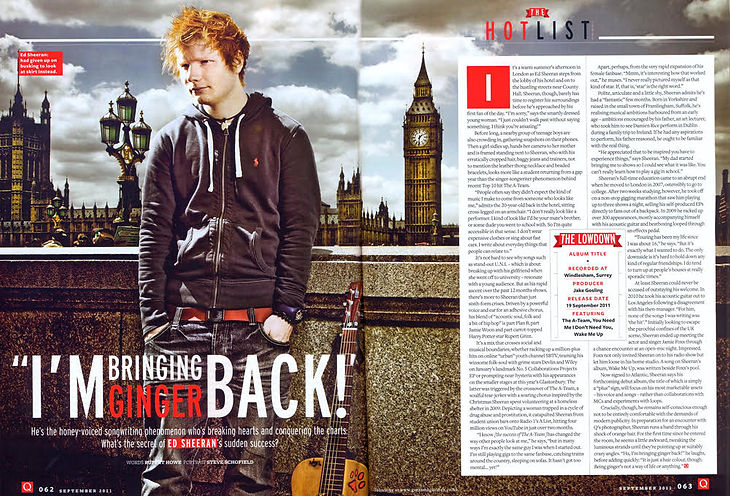
The main image on this double page takes up half of the spread, leaving the article to fill the other half. This instantly tells the reader who the article is based on and what kind of content the article may be. Ed Sheeran looks serious as he poses in this photograph, standing in front of the iconic Houses of Parliament in London, his hometown. The seriousness suggests that the article may be revealing for Sheeran, and is likely to be honest and open.
The pull out quote "I'm bringing ginger back!" gives the reader an insight as to what is to come in the article. Sheeran is famous for his ginger hair, and the quote suggests that his sudden fame is making this look increasingly popular. The word "ginger" is written in an orange font, where the rest of the quote and surrounding text is in white, making it eye-grabbing for the reader.
The colour scheme of this double page spread is a contrast of the colours orange, red, white and black. These stand out and complement one another. The red and white coincide with the brand identity of the magazine, whilst the black allows the text to be clear and the orange is unique to this particular "ginger" theme of the article.
Drop caps are being used at the beginning of the article, with the letter "I". This catches the eye which is consequently drawn towards the text, but also adds colour to the bulk of text to come. The article is detailed with a lot of text, so the drop caps help to make it look more attractive. The font of the "I" corresponds with the brand identity of the magazine as it is the same as the logo for "Q", white in colour upon a red, squared background.
"The Lowdown" acts as a centre of initial information, such as the album title and release date by Ed Sheeran, which is advertorial. This breaks up the bulk of text as well as providing key information. This also allows an addition of colour within the black text.
The footer of the magazine is simple, providing the logo of the magazine, with page number and issue date. This is discrete on the page and does not distract the eye from the article, yet this information can easily be referenced.