Jenny Forrest

PAGE FURNITURE ANALYSIS
The page furniture of a double page spread in a magazine is important for keeping the reader's attention and interest within the article, as although important, the text is not always the most intriguing thing to the audience. The design elements allow certain features to pop out, making them seem far more attractive and can relate to the theme of the entire magazine. These features are not always big, but their absence is noticeable. I will need to consider what counts as page furniture as I will need to use it on my own DPS, to make it unique from others and to add professional appeal. Page furniture also needs to correspond with the article of the magazine, and should complement larger features on the double page spread.
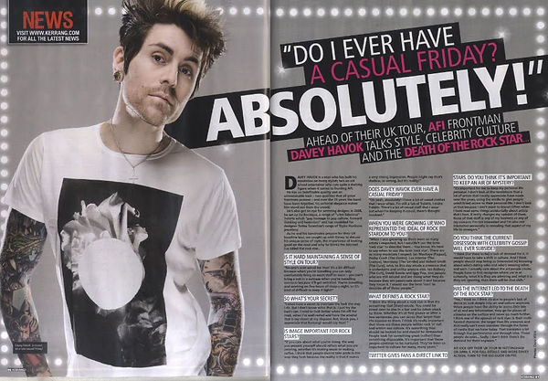
The border of this DPS is made up of clear, white dots, which surround the entire perimeter. These connotate bright spotlights, representing to touring, adding to the theme of fame and life on the road for a musical artist - the main feature of this article. The title and the intro are written upon a black squared background, which is also slanted on the page compared to the rest of the article, meaning that it is at a different angle to all other text. There are changes in font size and colour of text, from white to pink, which, shout the pull out quote to the reader, making it pop out. The black background of this textbox contrasts to the lilac background, a lighter colour, allowing the title and pull out quote to be eye-catching to the reader.

The dinosaur theme of this article is presented by scratches and the title. The title 'my dinosaur life' is in a scribbled font, making it more eye-grabbing to the reader as it differs from all other fonts used on the DPS and is of larger size. Many features of the DPS are orange; such as the scratches, the word 'dinosaur', corner tag for 'blink 182', drop caps, pull out quote and border, which all give consistency towards the colour scheme. The colour scheme is all black, white and orange, giving the DPS a house style and professional feel. The title and scratches complement one another to give a torn, broken and frayed effect. The drop caps is dominant due to being of large font and are in orange, whislt the rest of the text is in black, and seperate the text, making it more attractive to the reader. Although the border does not surround the whole DPS and is very thin, the orange height measurer represents the scale and size of the artist's fame, relating to the pull out quote; 'I love being recognised in the street' and the overall article.